The Evolution of Branding on Vintage Glass Bottle Seals

Most collectors assume that the seal on a vintage glass bottle is just a functional afterthought—a simple piece of metal or wax meant to keep the contents fresh. They're wrong. The evolution of branding on these seals tells a much deeper story about the industrialization of the food and beverage industry, the rise of mass marketing, and the shift from local craftsmanship to global-scale production. This post examines how the design, material, and iconography of bottle seals changed as brands moved from local milk dairies to national giants.
Why did bottle seal designs change so rapidly in the early 20th century?
Bottle seal designs changed rapidly because of the transition from local, unbranded glass to mass-produced, branded commodities that required instant recognition. In the late 1800s, many glass bottles were generic. If you bought a bottle of milk or soda, the "brand" was often just a handwritten label or a simple, stamped logo on the metal cap. As competition grew, companies realized that the seal—the very thing that kept the product safe—was prime real estate for marketing.
The shift was driven by two main factors: the invention of the crown cork and the rise of the "brand identity." Before the 1890s, many bottles used corks or rudimentary wire bail systems. These were slow to apply and lacked any consistent visual identity. Then, the Crown Cork changed everything. It was fast, standardized, and, most importantly, it provided a flat, circular surface for printing. This surface allowed for high-contrast colors and intricate logos that could be seen even from a distance.
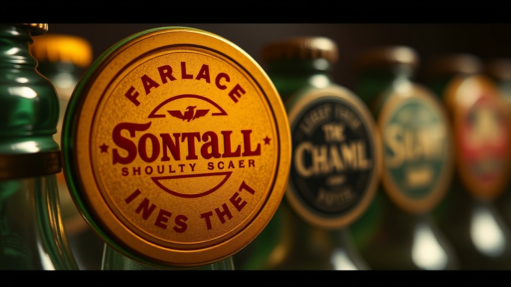
Think about the difference between a plain metal cap and a beautifully embossed tin seal. One is a utility; the other is a signal of quality. For a collector, that distinction is where the value lives.
What are the most common materials used in vintage bottle seals?
Vintage bottle seals are primarily made from tin, aluminum, or various types of wax and cork, depending on the era and the product type.
When you're hunting at flea markets or through online auctions, you'll notice a distinct hierarchy of materials. Understanding these helps you identify what you're actually looking at before you even check a price guide. Here is a breakdown of the most common materials you'll encounter in the world of caps and smalls:
- Tin-Plated Steel: The workhorse of the early 1900s. These are often heavier and more prone to rust if not stored in a dry environment.
- Aluminum: Became much more prevalent after the 1940s. These are lighter and generally more resistant to oxidation, making them a favorite for mid-century soda-pop collectors.
- Wax Seals: Often seen on high-end spirits or vintage apothecary bottles. These are much more fragile and harder to preserve without specialized preservation techniques.
- Bakelite or Early Plastics: Occasionally used for specialized medicine or tonic-style bottle tops during the mid-century era.
It's worth noting that the material isn't just about durability. It's about the aesthetic. A tin seal with a deep, embossed logo feels much more substantial in the hand than a modern, thin aluminum cap. That weight—that tactile feedback—is what collectors crave.
How does branding affect the value of a vintage seal?
Branding affects value by creating rarity through specific manufacturer-brand combinations or limited-run promotional designs. A plain, unbranded metal cap might be worth a few cents, but a cap featuring a specific, defunct brand like the original Coca-Cola or a local regional dairy can command much higher prices.
The value isn't just in the name; it's in the graphic design. During the 1950s, many companies used "collectible" caps to encourage repeat purchases. They would print different characters, sports themes, or even "winning" symbols on the underside of the seal. These are the "hidden gems" of the hobby. If you find a seal with a unique, non-standard graphic, you might be looking at a much more valuable piece than a standard brand cap.
The relationship between the brand and the seal design often follows these trends:
| Era | Primary Material | Common Branding Style | Collector Value Factor |
|---|---|---|---|
| Late 1800s | Cork/Wire | Minimal/None | Age & Rarity |
| 1900s - 1930s | Tin/Steel | Embossed Logos | Graphic Complexity |
| 1940s - 1960s | Aluminum | Printed Colors | Promotional Themes |
A lot of people overlook the "boring" looking seals, but if that seal has a specific, high-contrast color scheme or a rare typeface, it can be a standout piece. I've seen collectors spend hours looking for the perfect "unbranded" era piece, only to realize that a highly branded-era piece is actually the more sought-after item due to its visual pop.
The Role of Color and Typography
In the early days, color was expensive. Printing a multi-colored seal required multiple passes through a press, which was a significant cost for a small dairy or soda company. This is why many early 20th-century seals are monochromatic—either a single color of ink on a silver background or a single color of metal.
As printing technology improved, so did the "loudness" of the branding. By the time we get to the mid-century, you see vibrant reds, deep blues, and bright yellows. This was the golden age of the "visual hook." If a customer saw a bright, colorful cap on a shelf, they were more likely to grab it. For those of us who collect these, the vibrancy of the ink is a major indicator of how well the piece has been preserved. If the color is faded or "chalky," it's a sign of light damage or poor storage.
If you're interested in how these design shifts impacted more than just bottles, you might find the lost patterns in mid-century metal caps a fascinating companion piece. The transition from embossed metal to printed aluminum is a central theme in both.
One thing to watch out for: "reproduction" seals. Because certain vintage brands are so highly sought after, many companies produce high-quality-looking replicas. Always look at the edge of the seal. Authentic vintage seals often have slight irregularities in the crimping or the way the metal wraps around the bottle neck. A machine-perfect, flawless-looking seal is often a red flag. It's too perfect to be true, and in this hobby, it usually is.
When you're examining a collection, don't just look at the top. The underside—the part that actually touched the bottle—can tell you a lot about the manufacturing process. A smooth, unprinted underside often points to a more modern, mass-produced item, whereas a slightly rough or textured underside might suggest an older, more mechanical production method.
The evolution of the seal is really the evolution of how companies talk to us. It started with a simple promise of "this is a bottle of milk" and ended with a sophisticated, colorful, and highly branded experience designed to grab our attention. Whether you're a serious investor or just a curious observer, these little pieces of metal and glass hold a massive amount of history.