Lost Patterns and Forgotten Designs in Mid-Century Metal Caps

A collector opens a weathered wooden crate found in a basement in Portland, expecting standard soda tops, but finds instead a heavy, unbranded steel cap with a hand-stamped geometric pattern that doesn't match any known catalog. This is the reality of mid-century metal cap collecting—the more you look, the more you realize how much has been lost to time. This post examines the specific aesthetic shifts in metal cap production between 1945 and 1965, focusing on the lost graphic patterns and the manufacturing transitions that changed the hobby forever.
During the post-war era, the transition from heavy, hand-stamped steel to lighter, more decorative aluminum and thin-gauge tin changed the way manufacturers approached branding. We're looking at a period where graphic design wasn't just a logo; it was an integral part of the object's physical identity. Many of these designs—specifically the intricate linework and embossed textures—simply vanished when production moved toward high-speed, low-cost printing processes in the late 1960s.
Why Did Mid-Century Cap Designs Change So Drastically?
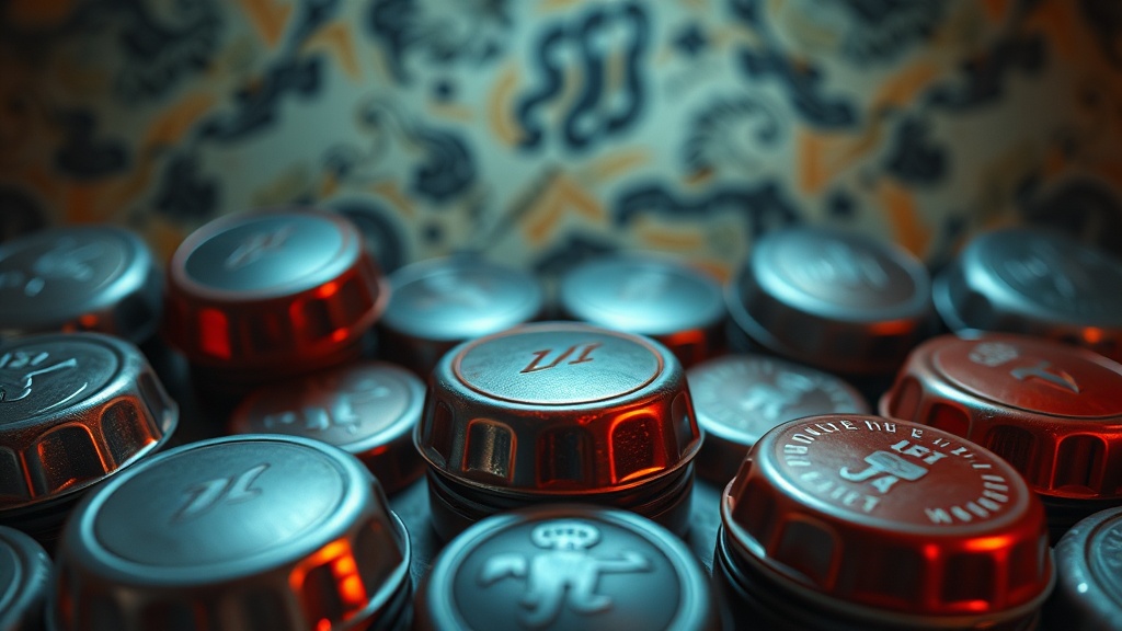
The primary reason for the shift was the move from high-relief embossing to flat, lithographed printing. Before the 1960s, many metal caps featured physical textures—ridges, raised lettering, and tactile patterns—that gave the objects a certain weight and presence. As production speeds increased, companies prioritized flat surfaces that could be printed with cheaper, faster ink-jet or offset methods. This killed the "hand-feel" of the collectible.
If you look at a standard Coca-Cola cap from the 1950s, the physical indentation of the brand name is a hallmark of that era's manufacturing. By the time the 1970s hit, most of that character was gone, replaced by a flat, thin-gauge metal that felt almost disposable. It’s a shame, really—those older pieces feel like artifacts rather than just trash. (If you're a collector who values tactile feedback, you'll notice the difference immediately.)
A few factors drove this evolution:
- Material Cost: Aluminum became more prevalent for its lightness and ease of recycling.
- Printing Speed: Flat surfaces allowed for faster rotation on assembly lines.
- Consumer Behavior: The move toward "instant gratification" meant heavy, ornate caps were seen as unnecessary overhead.
To understand the technicality behind these shifts, it helps to look at the history of the packaging and packaging industry, which shows how the focus shifted from durability to sheer volume. The designs didn't just get "simpler"; they became optimized for machines, not for the human hand.
What Are the Rarest Types of Mid-Century Metal Caps?
The rarest mid-century metal caps are typically those with "error-pattern" embossing or short-lived regional branding-specific designs. These are pieces where the physical stamp on the metal is slightly off-center or features a design that was only used for a single production run. Collectors often hunt for these because they represent a moment of manufacturing friction—a mistake that became a rarity.
Here is a breakdown of what to look for when grading the rarity of your mid-century metal finds:
| Type of Design | Description | Rarity Level |
|---|---|---|
| Deep-Embossed Steel | Heavy physical texture with raised lettering. | High |
| Regional Lithographed | Local soda brands with unique color palettes. | Medium |
| Geometric Patterned | Non-branded, purely aesthetic geometric shapes. | Very High |
| Standard Lithographed | Flat, printed logos on thin metal. | Low |
When you're out at a flea market or an estate sale, don't just look at the logo. Look at the edges and the way light hits the surface. If the light catches a physical ridge, you're likely looking at a more valuable, older-style cap. This is where many collectors fail—they see a faded logo and assume it's a common piece, missing the high-value embossed texture underneath. You can learn more about these subtle distinctions in my guide on identifying rare variations in vintage metal caps.
One thing to watch out for is the "faux-vintage" look. Some modern reproductions try to mimic that heavy, embossed feel of the 1950s, but they often lack the specific weight and the slightly irregular edges of the original metal. Real mid-century caps have a certain "grit" to them that modern manufacturing can't quite replicate.
How Can You Preserve the Metal Without Damage?
Preservation requires keeping the metal in a low-humidity environment to prevent oxidation and rust. Because mid-century caps often used thinner steel, they are incredibly susceptible to "pitting"—those tiny little holes that form when moisture reacts with the metal. You'll want to store them in a way that allows for airflow but keeps them away from direct moisture.
The most common mistake is using harsh chemicals to clean a rusted cap. If you see a bit of surface patina, leave it alone. If you must clean it, use a very mild approach. A slight bit of oxidation can actually prove authenticity, so don't be too aggressive. If you're dealing with a particularly delicate piece, I highly recommend checking out my guide to cleaning and preserving vintage milk caps before you touch it with anything.
Here are a few quick rules for storage:
- Avoid airtight plastic bins; they can trap moisture and cause condensation.
- Use acid-free paper or specialized display cases to prevent chemical reactions.
- Avoid direct sunlight, which can fade the lithographed colors.
- Keep metal caps away from any organic materials that might rot and release gases.
The goal isn't to make the cap look brand new. The goal is to stop the clock. A vintage cap with a little bit of "character" (or patina, if you're being professional) is far more valuable than a cleaned-up piece that has lost its historical-looking texture. A perfectly shiny, brand-new-looking 1952 cap is usually a sign of a bad cleaning job or a modern fake.
The metal used in these decades was often much more "honest" than what we see today. It was heavy, it was textured, and it was meant to be handled. When you hold one of these pieces, you're holding a physical piece of a time when manufacturing was still deeply connected to the tactile experience of the consumer. It’s a small detail, but it’s what makes the difference between a pile of scrap metal and a curated collection.