Rare Colorways and Limited Edition Prints Found in Mid-Century Milk Caps

The Neon Era of the 1960s
Pastel Perfection and Seasonal Releases
Metallic Sheen and High-Gloss Variations
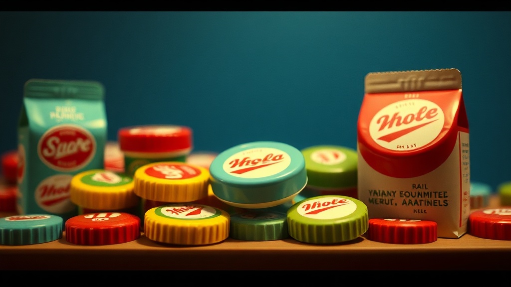
A collector unboxes a shipment of vintage metal caps from a 1950s soda manufacturer, only to find that the standard red lid is actually a deep, translucent cobalt. This isn't a mistake or a misprint. It’s a high-value rarity. This post explores the specific colorways and limited edition print styles found in mid-century milk cap collections, focusing on how these variations drive value in the current market.
What Makes Mid-Century Milk Cap Colorways Rare?
Rare colorways in mid-century milk caps are typically the result of limited production runs, seasonal marketing, or experimental dye batches that weren't meant for mass distribution. While standard colors like red, white, or navy were the norm, certain colors—like emerald green or a specific shade of burnt orange—were produced in much smaller quantities. These variations often occur when a company wanted to celebrate a holiday or a specific product launch.
Collectors often mistake a color variation for a damaged item, but a high-quality pigment is a sign of a premium piece. Sometimes, the metal itself was treated with a different finish to prevent corrosion, which inadvertently created a distinct aesthetic. It’s a subtle distinction, but for those of us in the niche, it's the difference between a $10 cap and a $100 cap.
The scarcity of these items usually comes down to three things:
- Seasonal Promotions: A "Winter Edition" cap might feature a frosted silver finish that wasn't available in the summer.
- Regional Exclusives: A manufacturer might only release a specific colorway for a single bottling plant in a specific state.
- Production Errors: Sometimes, a "wrong" color is actually a documented, limited-run error that collectors actively seek out.
If you're looking at a collection, keep an eye out for the sheen. A matte finish on a mid-century cap is often more valuable than a high-gloss one because it suggests a more specialized production method. (I've seen collectors spend years tracking down a single matte-finish variant.)
How Can You Identify Limited Edition Prints?
Limited edition prints are identified by unique iconography, specialized typography, or branding elements that deviate from the standard manufacturer's template. Unlike the standard logos used for mass-marketed goods, these prints often feature intricate illustrations or highly detailed text that was more expensive to produce.
One way to spot these is to look at the precision of the printing. Standard mid-century caps often had slight imperfections, but limited editions were frequently used to showcase a company's peak technology. You might see a more complex etching or a multi-colored print that isn't present on the "common" versions of the same brand. To understand the technical side of these designs, you can look at the history of lithography, which was the primary method for these detailed prints.
When examining a piece, check the edges of the print. A high-end limited edition will have much sharper lines than a standard-issue cap. If the design looks "blurry" or "cheap," it's likely a standard production piece. If the detail is crisp and the colors are vibrant, you might be holding something special.
Common Print Variations to Watch For:
- Themed Illustrations: Caps featuring local landmarks or specific historical events.
- Embossed Text: Where the branding isn't just printed, but physically raised from the metal.
- Dual-Tone Designs: Using two distinct colors in a way that requires a second printing pass.
It’s worth noting that many of these prints were meant to be temporary. A company might use a specific design for a single month to drive sales of a new soda flavor. That's why finding an intact, un-dented version of these prints is so difficult today.
| Feature | Standard Production | Limited/Rare Edition |
|---|---|---|
| Color Palette | Primary colors (Red, Blue, White) | Secondary or Metallic (Gold, Teal, Matte) |
| Print Detail | Simple, bold branding | Intricate, fine-line illustrations |
| Distribution | Mass-market/National | Regional/Seasonal/Promotional |
| Collectibility | Common/Low value | High value/Highly sought after |
Why Does Condition Matter for Rare Colorways?
Condition is the single most important factor in determining the final value of a rare colorway or a limited edition print. Even the rarest color in the world won't command a high price if the metal is rusted, the paint is peeling, or the edges are bent.
In the world of mid-century collectibles, "condition" isn't just about looking pretty. It's about the integrity of the metal and the preservation of the pigment. Because many of these caps were exposed to moisture and varying temperatures, the oxidation process can be brutal. A rare emerald green cap is useless to a serious collector if the green has been replaced by rust. If you're unsure how to handle your pieces, you should follow strict guidelines on how to store milk caps flat to prevent damage.
When assessing a piece, look for:
- Color Fading: Has sunlight bleached the pigment?
- Edge Integrity: Are the crimped edges still sharp?
- Surface Patina: Is the "aging" attractive, or is it actual corrosion?
A common mistake is assuming that a "new" look is better. In some cases, a slight patina is expected, but a "mint" condition piece is the gold standard. For more technical advice on how to grade your finds, check out my guide on assessing the condition of vintage milk caps.
The market for these items is driven by enthusiasts who know exactly what to look for. A collector isn't just looking for a piece of metal; they're looking for a piece of history. If you find a cap that has a unique colorway, treat it with extreme care. One wrong move with a cleaning solution could strip away the very pigment that makes it valuable.
The value of a collectible is often found in the details most people overlook. A slight change in the shade of a logo or a slightly different font can turn a common item into a centerpiece. It's a game of patience and a keen eye. Always check your sources and cross-reference with historical branding records to ensure what you have is actually a rarity and not just a common variant.